
Jerry Uelsmann

1. Initially, I was very impressed but also confused as to how Uelsmann got to the final products, as his photographs have other images layered within them. To be able to achieve this "photomontage" without Photoshop must have taken a lot of hard work and creativity, which I admire. The images themselves range from astounding to unsettling, but overall I like them.


Jerry Uelsmann: A Celebration of His Life and Art - Harn Museum of Art

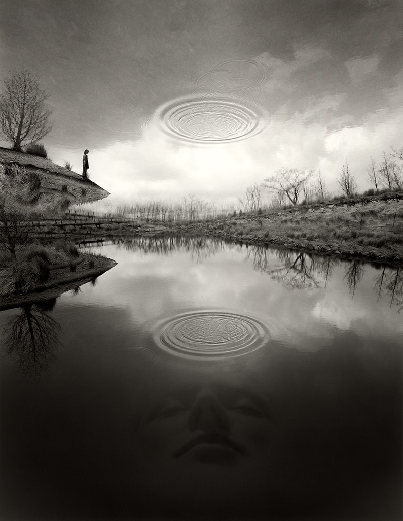
2. I would categorize Jerry Uelsmann's work as photomontage photography, typically contrasting a landscape/natural image with a human/manmade subject.
Jerry Uelsmann
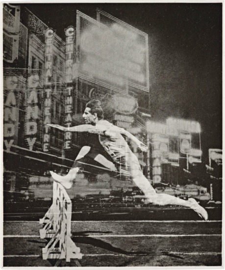
3. El Lissitzsky was a Russian artist, designer, and photographer who, like Uelsmann, utilized the technique of creating a photomontage, resulting in fascinating layered images. However, Lissitzsky's images focus more on humans, whereas Uelsmann's do not, and if they do, the person is much smaller in the frame, largely trumped by their natural surroundings. I like both of their works, but overall I prefer Lissitzsky's due to its more intimate, personal energy. Looking at his photos feels like a message/commentary has been received successfully by the viewer, but Uelsmann's message feels distant, or even nonexistent.

El Lissitzky - Photographs London Lot 75 May 2012 | PhillipsJerry Uelsmann | Untitled 1969 (Floating Tree) (1969) | Available for Sale  | Artsy

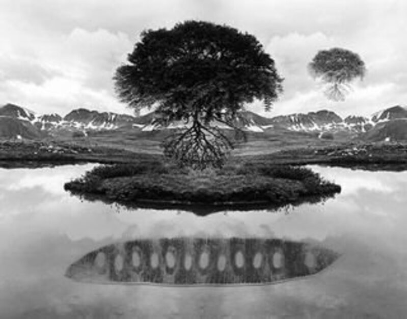
4. If someone remade Uelsmann's work today, they would utilize his signature contrast between man and nature, but use it to provide social commentary, on issues like climate change or urban decay.Jerry Uelsmann, Surreal Image-Maker, Dies at 87 - The New York Times

5. Uelsmann's work embodies his quote perfectly, as he explored the world of photography in a way that not many had before. By giving himself permission to be creative, and even a little weird, his photographs were all the better for it.

Interview with Jerry Uelsmann: Invented Realities — Musée Magazine

Comments

Popular posts from this blog

Michael Kenna

 1. I immediately fell in love with Kenna's work when I first saw it, because it is simple and yet stark. I love the mysterious and sometimes a little spooky energy it has due to the shots being in black and white. His work has a peaceful, almost nostalgic energy due to the long exposure that makes it feel like the viewer has been suspended alone in time and space. 2. Michael Kenna is a monochromatic landscape photographer. He often finds simple objects, natural and manmade, and captures them in a way that makes them stand out, despite (and perhaps because of) being in shades of gray, black, and white. 3. Michael Kenna and Ansel Adams both captured the beauty of black and white landscapes, utilizing the contrast between light and dark to emphasize certain elements of their photos. Adams gravitates towards impressive, sprawling landscapes in places like Yellowstone National Park, or Yosemite, while each of Kenna's photos tends to focus on one complete subject, like a tree, rathe...

Josef Sudek

1 . The work is calming and a little whimsical. In my opinion, it perfectly captures the calm after the storm and the beauty in abandonment/isolation. The shots have a beautiful, dark gray aesthetic, which I enjoy a lot. 2.  Sudek's work is classified as neo-romantic, but if I had to categorize it I would say it is melancholy life photography, just based on the gray tones, solitary objects, and places relatively void of bustling city life/people, etc. 3.  Fan Ho and Josef Sudek have some similar shots in the way they capture rays of soft sunlight filtering between buildings/architectural structures, as shown below. Sudek has less work featuring this motif, but Ho often focuses on that. Overall, I prefer Fan Ho, but between the photos shown below, I enjoy Sudek's more. 4. If someone made Sudek's work today, it would more heavily focus on ruination and abandonment, really honing in on the decline of our world in terms of the current conflicts and division we face globally. 5...

David LaChapelle

1. The only way I can describe my initial reaction to LaChapelle's work is "weirded out". His work is of good quality and it's compositionally interesting, but it's incredibly bizarre, and just not the type of art I typically enjoy. 2. David LaChapelle is a commercial photographer because he photographs mainly celebrities for magazines to promote their image and allow the magazine to profit. 3. Marino Testino's portraits of celebrities are very tame compared to LaChapelle's. He has also worked for popular magazines such as Vogue and Vanity Fair, but his images follow the mainstream: they capture celebrities in all their glory and glamour, perhaps adding a bold feauture or two. LaChapelle, on the other hand, magnifies the bold features and makes them the theme of his work. I'm not a huge fan of either of their works, but I don't hate them, either. There is clear craftsmanship involved for each, and I respect that, even if LaChapelle's is a litt...