David LaChapelle

1. The only way I can describe my initial reaction to LaChapelle's work is "weirded out". His work is of good quality and it's compositionally interesting, but it's incredibly bizarre, and just not the type of art I typically enjoy.
David LaChapelle: A Surreal and Vibrant Vision in Fashion Photography

2. David LaChapelle is a commercial photographer because he photographs mainly celebrities for magazines to promote their image and allow the magazine to profit.
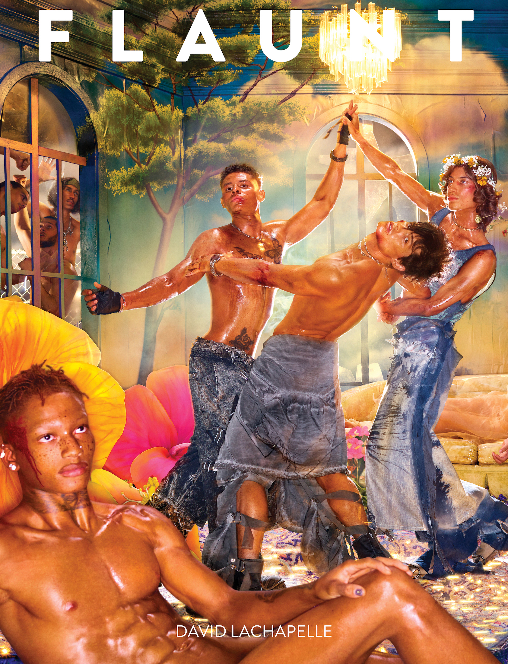
David LaChapelle | For Then It Was Vital, For Then It Was Graceful
3. Marino Testino's portraits of celebrities are very tame compared to LaChapelle's. He has also worked for popular magazines such as Vogue and Vanity Fair, but his images follow the mainstream: they capture celebrities in all their glory and glamour, perhaps adding a bold feauture or two. LaChapelle, on the other hand, magnifies the bold features and makes them the theme of his work. I'm not a huge fan of either of their works, but I don't hate them, either. There is clear craftsmanship involved for each, and I respect that, even if LaChapelle's is a little unsettling.

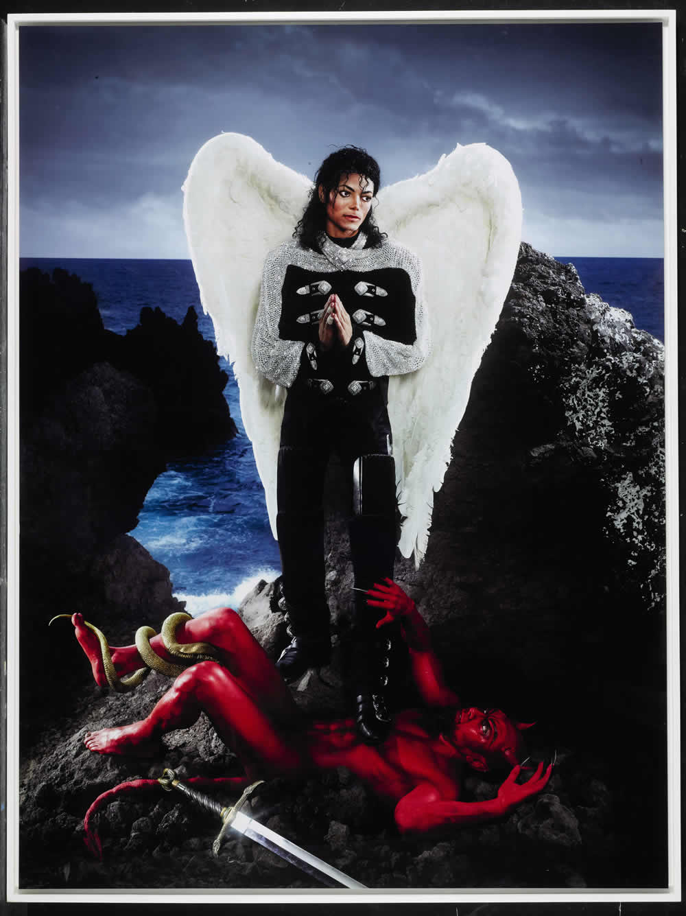
MARIO TESTINO | PHOTOGRAPHY  David LaChapelle, American Jesus: Archangel Michael Jackson, 64 x 48 inches
4. A hallmark of LaChapelle's work is the contrast of a bright, bold, luxurious figure set against a natural, sometimes harsh, environment as the background. If someone were to remake his work, I believe they would use places ravaged by war, climate change, natural disaster, etc. as the background, while still keeping the materialistic figure as the focal point. This would emphasize the discrepancy between first world materialism and third world poverty, making a beautiful picture as well as sending an important political/social message.
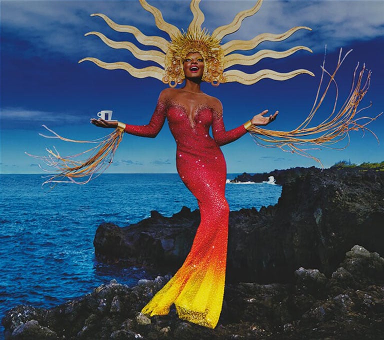
Lavazza Calendar 2020 by David LaChapelle


5. LaChapelle's quote concisely encapsulates the bold themes of his photographs, and offers an explanation as to why he chooses to make them so bizzare and bright. His pictures really do tell a story as well as, and perhaps even better than, the written word can.

Comments

Popular posts from this blog

Michael Kenna

 1. I immediately fell in love with Kenna's work when I first saw it, because it is simple and yet stark. I love the mysterious and sometimes a little spooky energy it has due to the shots being in black and white. His work has a peaceful, almost nostalgic energy due to the long exposure that makes it feel like the viewer has been suspended alone in time and space. 2. Michael Kenna is a monochromatic landscape photographer. He often finds simple objects, natural and manmade, and captures them in a way that makes them stand out, despite (and perhaps because of) being in shades of gray, black, and white. 3. Michael Kenna and Ansel Adams both captured the beauty of black and white landscapes, utilizing the contrast between light and dark to emphasize certain elements of their photos. Adams gravitates towards impressive, sprawling landscapes in places like Yellowstone National Park, or Yosemite, while each of Kenna's photos tends to focus on one complete subject, like a tree, rathe...

Josef Sudek

1 . The work is calming and a little whimsical. In my opinion, it perfectly captures the calm after the storm and the beauty in abandonment/isolation. The shots have a beautiful, dark gray aesthetic, which I enjoy a lot. 2.  Sudek's work is classified as neo-romantic, but if I had to categorize it I would say it is melancholy life photography, just based on the gray tones, solitary objects, and places relatively void of bustling city life/people, etc. 3.  Fan Ho and Josef Sudek have some similar shots in the way they capture rays of soft sunlight filtering between buildings/architectural structures, as shown below. Sudek has less work featuring this motif, but Ho often focuses on that. Overall, I prefer Fan Ho, but between the photos shown below, I enjoy Sudek's more. 4. If someone made Sudek's work today, it would more heavily focus on ruination and abandonment, really honing in on the decline of our world in terms of the current conflicts and division we face globally. 5...

Steve McCurry

1. My initial reaction to McCurry's work was awe at how vibrant each photograph is, and how vividly I could sense/feel the emotions portrayed by his subjects.  2. I would categorize McCurry's work as multicultural humanist photography, as he mainly captures people of all different backgrounds and their struggles/the culture that is retained within them even throughout conflict.  3. Henri Cartier-Bresson is also a humanist photographer, but I prefer McCurry's work more, due to his stunning use of vibrant colors, adding to his cultural themes. Bresson's work is mainly French street photography, therefore it misses out on capturing the beauty and pain of other cultures. 4. I honestly love McCurry's work, and I can't think of any changes that would make it better. However, someone else might want to try more candid photography of unsuspecting subjects, instead of making the connection with the subjects first. I think it would be less respectful and successful that w...